Shape, Space, and Scansion in Picture Book Text—Part 1
I’ve always been fascinated by writing picture book text, which is in effect, the work of writing what feels like half a book. Only the words, but we know the book won’t be complete until pictures arrive to fill in most of the spread that our words get sprinkled over. So I thought it might be fun and maybe informative as well, to take a look at how I did this, exactly, with one of my picture books. What did I put in? What did I leave out?
To start with, here’s the final draft of the first manuscript page of Look! Look! that I submitted to Groundwood Books in 2023.

I’ve posted earlier about how the sequence of spreads changed after the illustrator began to work on the art.
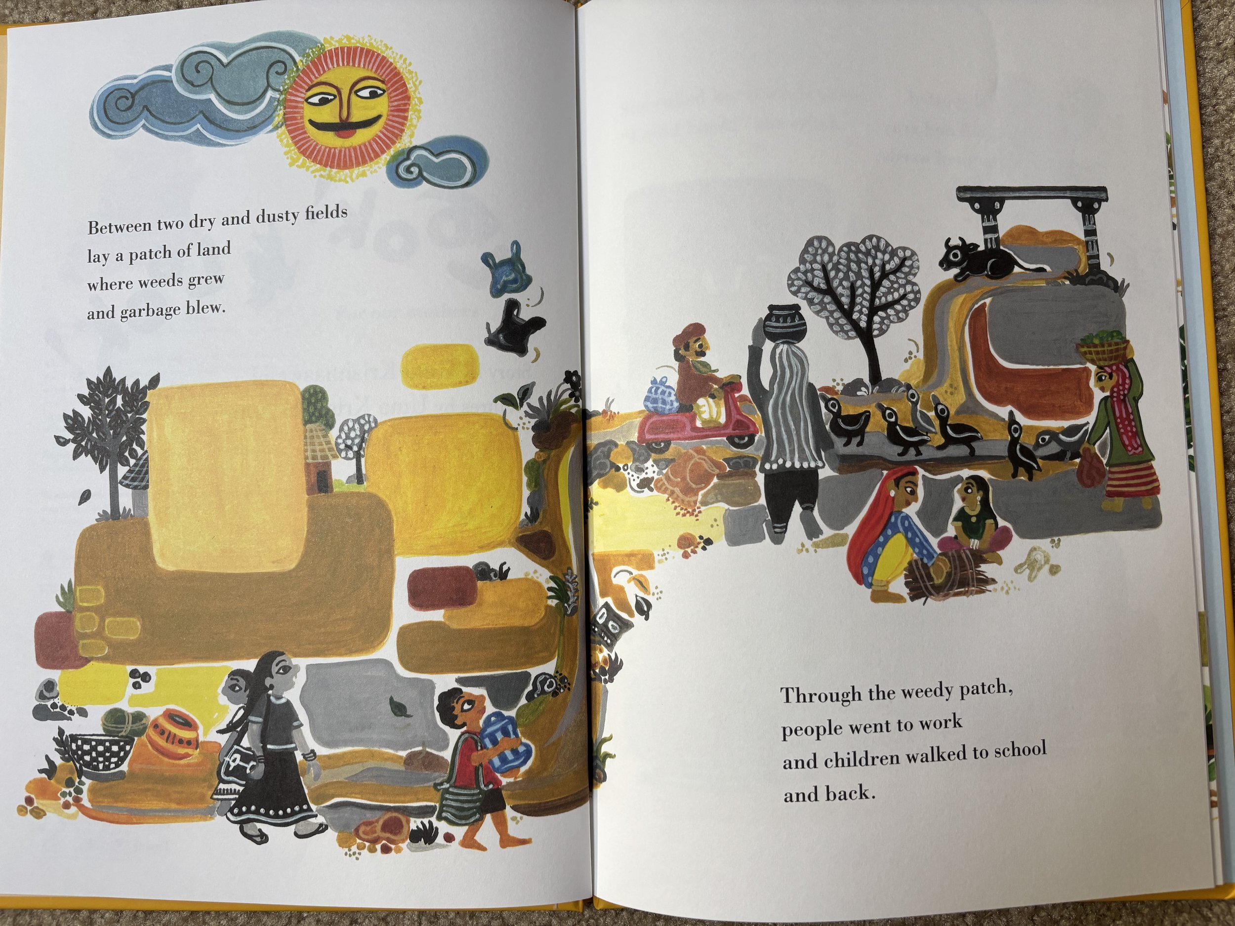
This half page of text translates to two and a half spreads in the book: the words on the first spread remain unchanged, but what a world of difference it makes to have them placed on facing pages, with the richness of the images in between. And look at all that space. The shape of each stanza feels embraced by the art.
Space, whether it’s literally white like this or filled in with a full bleed illustration, is the picture book writer’s friend. As I wrote drafts of this story, I was driven by my need to get from beginning to end without losing the energy of a piece written in stanzas. But I’d argue that the only way to do that in picture book text is by leaving lots of room for illustration. In this case, leaving out excess description gives me this whimsical, kindly mustachioed solar presence in my story that I honestly could not have imagined because dazzling visualization is not how my imagination works. And I’m delighted to see how the wind-blown plastic bags move in a visual echo of my lines—read them out loud and you can feel the uplift.
As for the art note I thought I needed? Here’s what happened in the illustrated second spread:

Uma (yes, the illustrator shares my name—almost) uses no more than two squiggly lines to suggest a little carving on the stone the girl’s uncovering but it’s not important to this spread. The forward momentum of calling the friends takes precedence. As a writer, I can’t always see the focal point of a spread until the pictures are in place. I must have taken the art note out and put it back in a dozen times. In the end it may have been a pointer to a much later spread where the architecture around the well becomes fully uncovered and restored—that too shows up in the art even though at that point in the narrative, it isn’t anywhere in my text.
Stay tuned for thoughts from two writer friends on the gap between intentions and final outcome in their picture book text.