Shape, Space and Scansion in Picture Book Text—Part 2
As a picture book writer who is not also an illustrator, I only have my mind to work with, so when people ask me how my process works, it’s easy to freeze, to default to not knowing. Not knowing makes me inclined to wonder if the art and craft of it all might be purely instinctive. Or worse, perhaps a fluke—on my part, anyway. So while I was looking at my own book, Look! Look! in this context, I thought I’d ask a couple of writers in my critique group (affectionately dubbed The Autodidacts) to weigh in: Vaunda Micheaux Nelson and Caroline Starr Rose.
I asked each of them to think about one of her picture books to find something that changed between the early draft and the final book.
Vaunda wrote about Almost to Freedom (2004 Coretta Scott King Illustrator Honor Book):

Illustration by Colin Bootman, from Almost to Freedom, courtesy of Vaunda Micheaux Nelson
I was working on the final phase of Almost to Freedom. The story is historical — about a family trying to escape slavery — and I am always concerned about getting the history correct. I had seen early sketches, but they don’t always show every detail to come. When completed art arrived, I was frustrated. One of Colin Bootman’s illustrations did not reflect my text. Colin had drawn my main characters picking cotton with the overseer (mounted on a horse) approaching in the background. My text read, “He’s walkin’ over carryin’ his whip.”
I thought, “He’s on a horse!” feeling Colin hadn’t followed the text. A moment later I realized Colin was right. The overseer most likely would have been on a horse. It was a simple fix — one single-word change. Our text now reads, “He’s ridin’ over carryin’ his whip.” I like this better, and I learned something that day — to step out of my own vision and look through the artist’s eyes.
Caroline reflected on A Race Around the World: The True Story of Nellie Bly and Elizabeth Bisland (Albert Whitman, 2019. Here’s what her draft text looked like:

She writes:
The spirit of my early draft is still present in the final version, though vastly improved. I’ve both cut unnecessary details (why Nellie’s ship was delayed) and expanded on others (lingering on the beauty and joy Elizabeth experienced in Japan). For both women the final spread shows more of their experiences and emotional responses rather than just the facts. I also don’t spell out that these events were happening at the same time. Instead, the spread with one page devoted to Nellie and the other to Elizabeth shows this to the reader.
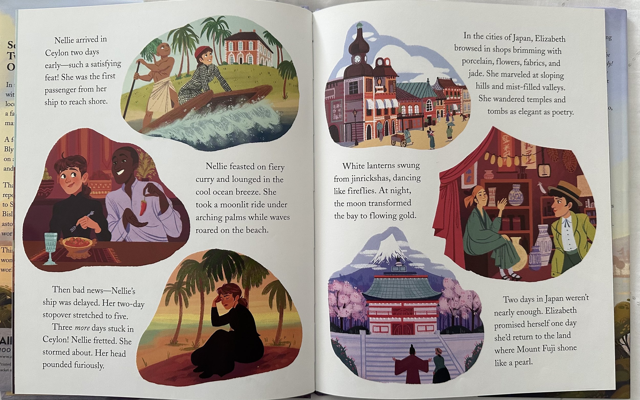
Spread from A Race Around the World, illustrated by Alexandra Bye, image courtesy of Caroline Starr Rose
Throughout my earlier drafts I left art notes with various newspaper headlines. This, I imagined, would show what readers back home would be hearing about the race as it happened. They weren’t included in the final book, and I think that was a great decision. There was no need to “tell” what as going on through a headline. The text and illustrations already showed this. To add another element to the storytelling would have been too much visually.
So…not a fluke, then. Vaun talks about how the text became our text, as opposed to my text. The placement of an image changed one little word, and that tiny change made the work collaborative and richer for it. And Caroline, too, shows us how the “telling” of a story gravitated from text to image once the illustrations were juxtaposed with her words.
It’s all about the shape of the story, the way the words scan on a page, how much space a writer gives to the art that is yet to come. We can’t always see that in early drafts, but it’s all the more reason to treat picture book text as an exercise in creating and then letting go.